
We’ve all been through the struggle of choosing colours, whether we were painting a room, picking out clothes at Big W, or designing an entire kitchen. Not only is it hard to pick colours, but everyone views colours differently. So how do you pick colours to satisfy everyone’s preferences? Is there something about colours people can universally agree with? Colour psychology theory could possibly answer this question but the theory itself is pretty complex, so let’s explore it in the context of our everyday lives. Let’s design a kitchen using colour psychology theory and see what happens.

A small sample of Corian colours
To keep things simple, we’re going to use Corian solid surface as our primary example as Interiors SA have experience in a range of Corian colours making it a little easier to explain. Corian is an acrylic based solid surface material, often used for benchtops and splashbacks and praised for sturdiness and cost-effective nature, read more here if you’re unfamiliar.
Warm Colours - Golden Onyx, Hot, Imperial Yellow
Warm colours are associated with a range of emotions in colour psychology which can lead to some confusion. It is believed that colours like yellow and orange can be associated with positive emotions such as happiness, whereas red can often be linked to anger or danger. To avoid the more negative emotions that can be elicited from warm colours we suggest a touch of colour, such as a Corian kitchen island benchtop. Warm colours have also been linked to hunger and the desire to eat, something that comes in handy with picky eaters or when you have guests over. Restaurants subtly use warm colours on menus and benchtops to entice people into ordering more food – those emotions can also make food feel more appetising and enjoyable.
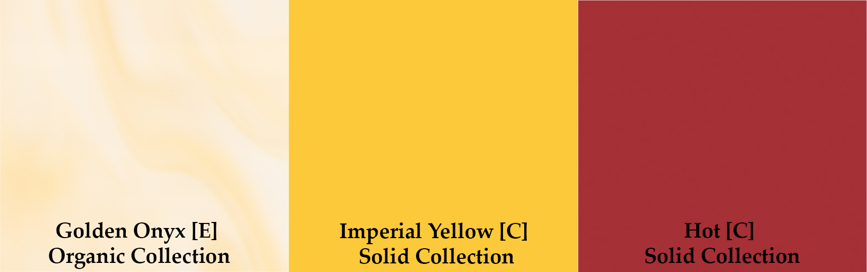
A few warm Corian colours
Cool Colours - Evening Prima, Verdant, Mint Ice
In contrast to the wide range of emotions linked to warm colours, cooler colours tend to have a calming effect with far less variation on emotions. Cool colours are great in a stressful household, or to add a splash of creative inspiration while you’re cooking in the kitchen. A light green or blue Corian splashback can make all the difference to your confidence in trying that new recipe or to keep the peace when the family comes over for the holidays. In the past we’ve suggested neutral coloured cabinets and an Corian Evening Prima splashback or benchtop to draw attention to the calming mood.

A few cool Corian colours
White Colours - Pearl, Light Ash, Venaro White
Surely neutral colours are just that – neutral. But in fact, colour psychology theory suggests that even white can be consistently linked to multiple different emotions. While neutrals are often used to draw attention to more bold colours, white tends to create a youthful and fresh look. Hospitals, labs, and kitchens worldwide have been using Corian’s Glacier White to evoke a feeling of safety in a clean environment. White has also been used as staple for modern apartments and houses, often being used to showcase innovative and creative designs.

A few white Corian colours
Black Colours - Deep Night Sky, Cosmos Prima, Deep Black Quartz
Perhaps complimenting the fresh and modern white, we have the powerful and mysterious emotions associated with the colour black. To create an atmosphere of professionalism and power law firms and big businesses use black as a key colour. In many cultures the colour black is linked with mourning and sadness so, again, we suggest a light splash of black to evoke some emotions of mystery and power without touching on negative emotions. Deep Black Quartz has been used in a few of our projects, especially apartments, it makes for a great staple colour for splashbacks and benchtops without overpowering the look.

A sample of black Corian Colours
Grey Colours - Grey Onyx, Smokedrift Prima, Stratus
To close out our list and tie everything together, we have the middle colour (some might call it a shade): grey. In colour psychology, grey has been shown to link accentuate the affects of other colours. Grey used with black could create a bolder and more mysterious look, whereas grey combined with a warm colour supports a more exciting mood without the overpowering emotions coming through. Grey Onyx and Stratus are often used in jobs we have completed to balance brighter colours used for warm or cool looks.

A sample of grey Corian colours
Through exploring colour psychology theory, we can try to support emotional development and – more specifically in the construction industry, we can use this theory to help make informed design decisions to create a mood and look central to a huge variety of people. Through appropriately balancing colours and using splashbacks and benchtops for variety, Interiors SA have managed to incorporate colour theory into many jobs and will continue to do so.
If you are interested in starting a new project or learning more, click below: